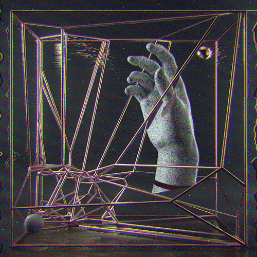
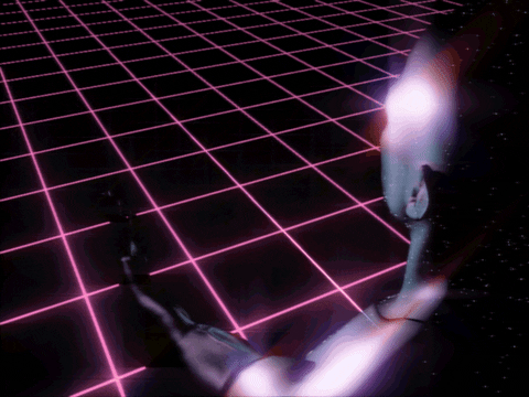
B+W VERSION
I like the variety of texture here; grainy background and smooth sculptural hand really highlights the flat graphic cube. Maybe when it's a moving gif it will look more interesting, but I do find this version to be a bit bland, no colour giving it an emotion or angle.
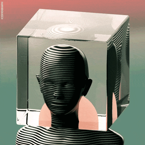
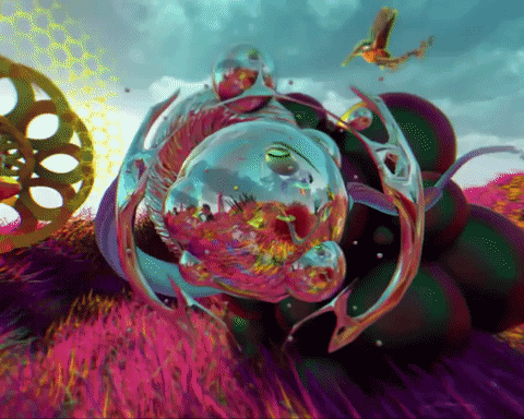
DECONSTRUCTION
Again, the background creates not enough contrast, and the black lines disappear. Perhaps a white outline would help create a stronger, crisper line.
Add comment
Details